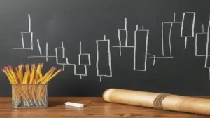
 In the fast-paced world of trading, mastering technical analysis is key to making smart decisions and boosting profits. With so many tools available, one that stands out is the candlestick chart. Known for its versatility, candlestick charts offer a clear way to understand market sentiment and predict potential price movements.
Understanding Candlestick Charts
Candlestick charts are a visual representation of price movements over a specific period, typically ranging from minutes to days. Each candlestick on the chart provides valuable information about the opening, closing, high, and low prices within the chosen time frame.
The Anatomy of a Candlestick
A typical candlestick is made up of two key parts: the body and the wicks (also called shadows). The body shows the price range between the opening and closing prices of the asset during a specific time period. The color of the body is important because it indicates whether the price closed higher or lower than it opened. If the closing price is higher, the candlestick is usually colored green or white, signaling a bullish movement. If the closing price is lower, the candlestick is often colored red or black, indicating a bearish trend.
The wicks extend from the top and bottom of the body and represent the highest and lowest prices reached during that trading period. The length of the wicks can provide useful insights into how volatile the market was during that time, helping traders understand the strength of the price movement.
Interpreting Candlestick Patterns
Candlestick patterns offer valuable insights into market sentiment and potential price reversals. While there are numerous candlestick patterns, some of the most common ones include:
- Doji: A doji occurs when the opening and closing prices are virtually the same, indicating indecision in the market and potential trend reversal.
- Hammer and Hanging Man: These patterns feature a small body with a long lower wick and little to no upper wick. A hammer forms at the bottom of a downtrend and suggests a potential bullish reversal, while a hanging man forms at the top of an uptrend and signals a possible bearish reversal.
- Engulfing Patterns: Bullish engulfing patterns occur when a large bullish candle completely engulfs the previous bearish candle, signaling a potential bullish reversal. Conversely, bearish engulfing patterns occur when a large bearish candle engulfs the previous bullish candle, indicating a potential bearish reversal.
Using Candlestick Analysis in Trading
Candlestick analysis can be used in different trading strategies, making it a versatile tool for traders. Whether you’re focusing on trend following, reversal trading, or breakout trading, understanding candlestick patterns can help you make better decisions.
By recognizing key patterns, such as dojis, hammers, or engulfing candles, traders can gain insights into potential price movements. When combined with other technical indicators like moving averages or RSI, these patterns become even more powerful. Using candlestick analysis alongside these tools allows traders to make more informed decisions and increase their chances of improving overall profitability.
Risk Management Considerations
While candlestick analysis can provide valuable insights into market dynamics, it’s essential to practice proper risk management to protect capital. This includes setting stop-loss orders, managing position sizes, and avoiding overleveraging.
Analyzing candlestick charts is a fundamental skill for traders seeking to navigate the complex world of financial markets. By understanding the anatomy of candlesticks, interpreting candlestick patterns, and integrating candlestick analysis into trading strategies, traders can gain a competitive edge and achieve greater success in their trading endeavors. So why wait? Start analyzing candlestick charts today and unlock the secrets of trading mastery.